Day 3 - Adding Visual styles to UI I
Mentored by : Ritika Gupta
Platforms used : jsfiddle and codepen.io
Introduction to CSS
- CSS may be divided into 3 types: inline CSS, embedded CSS, External CSS.
- Inline CSS: when the styles are coded as an attribute of the element or tag in the HTML file. E.g.
<p style="color: darkred;"> - Embedded CSS: when the styles are coded as a part of head tag in the HTML file. E.g.
<head> <style>p{color: pink;} </style> </head> - External CSS: A designated CSS file is maintained containing only the styles , with an extension .css and is called upon in the HTML file through “link” tag. E.g.
<link href="styles.css">
- Inline CSS: when the styles are coded as an attribute of the element or tag in the HTML file. E.g.
-
Cascading Style Sheets comprise of several property-value set of code to embed visually appealing styles to HTML coded web pages or websites.
-
The Grammar to define property-value set is: “property : value;” the property name followed by a colon further followed by the value and ended by a semi-colon. E.g.
color : blue; -
These property-value sets are then supplied to elements of the web page, we wish to style, called selectors in CSS. Grammar for the same is as follows:
"selector{ property: value; }" -
A Selector is a piece of code that selects and brings element to be styled, to the CSS table. E.g.
p{color: red;} - Selectors may be of wide variety, common of which are given here:
- Element Name E.g.
p, h1, article, nav, div, input etc. - Element Class E.g.
.box, .container etc. - Element Id E.g.
#box, #container etc. - Universal Selector E.g.
*{}. A Universal Selector selects all the elements or tags on a web page likep, body, footer, header, span, a, img, div, etc. - Element Name followed by attribute-value pair E.g.
input[type="text"] - Element name/class/id followed by attribute-value prefix. E.g.
div[class^="box"],form-group[class^="box"],#form-group[class^="box"] - Element name/class/id followed by attribute-value suffix. E.g.
div[class$="wrapper"],frame[class$="wrapper"], #frame[class$="wrapper"] - Element name/class/id followed by attribute-value substring. E.g.
div[class*="wrapper"], .frame[class*="wrapper"], #frame[class*="wrapper"] - homogenous/heterogenous combination of all the above mentioned selectors. E.g.
p.child{color: green;}, h2#top{color: cyan;}, div[class*="group"] input[type="text"]{font-size: 20px; border: 1px solid red;}
- Element Name E.g.
-
What if overriding styles are written for the same element by differentselectors?: The specificity rule follows for different selectors which sets the priority for them.
-
The standard specificity rule is: inline style > id > class > element name
-
Specificity Rule when same method is style is written multiple times: The greater valued line of code will execute. E.g. on line 4
p{color: green}and on line 10 of same sheetp{color: blue}, paragraph will be of blue color. -
Specificity when dealing with
"!important": It tends to pick the selector to which it is applied and place it on the top of hierarchy stack. E.g.p{color: red !important}
-
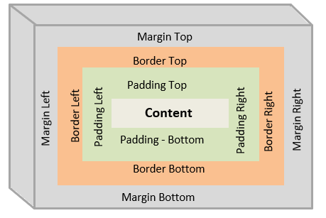
CSS Box Model
-
Every Element or tag placed on a web page may be imagined of as abox. This box contains an invisible environment around it’s edges marking it’s features. These features are margins -> borders -> padding-> content
-
Property-Value Set related to CSS box-model is ‘box-sizing’.
-
box-sizing: border-box | content-box
-
By Default, the box-sizing property is set to the value content-box which means that padding and borders will not be included in the width and height of an element and will add their values to the width and height of the element , changing it’s desired width and height.
-
Let’s take an example to understand this concept in detail: We have a ‘div’ tag whose total width should be 300px and height should be 100px, border-width should be 3px and padding should be 20px from all edges.
-
box-sizing: content-box will make total width of div = 346px (width of div 300px + padding-left 20px + padding-right 20px + border-width-left 3px + border-width-right 3px) violating the requirement of width to be 300px only.
-
box-sizing: content-box will make total height of div = 146px (height of div 100px + padding-top 20px + padding-bottom 20px + border-widthtop 3px + border-width-bottom 3px) violating the requirement of height to be 100px only.
-
To solve this problem: we have box-sizing: border-box
-
box-sizing: border-box, helps to consume dimensions for padding and border value from mentioned value of width and height of ‘div’ tag.
-
For an example: we have given width = 300px and height = 100px for ‘div’ padding = 20px and border = 3px, hence values for padding and border are auto adjusted from width and height values.
-
box-sizing: border-box, will keep total height of div 100px by adjusting values like height 54px (height of div 100px - padding top 20px - padding bottom 20px - border top 3px - border-bottom 3px)
-
box-sizing: border-box, will keep total width of div 300px by adjusting values like width 254px (width of div 300px - padding left 20px - padding right 20px - border right 3px - border left 3px)
Typography and Formatting
-
font-family: Segoe UI | Times New Roman | Comic Sans | Helvetica | etc.
-
Commonly fallback values are given for such properties to ensure the display does not break on any browser. Fallback values may be given in a single property separated by commas. E.g.
font-family: helvetica,sansserif. -
color : any color value (hex, rgb, rgba or name of the color).
-
font-size: any numeric value(in px, em, rem etc. units)
-
text-decoration: none | underline |line-through | underline | overline etc.
-
font-weight: normal | bold | bolder | lighter | number | initial | inherit;
-
text-transform: uppercase | lowercase | capitalize | none etc.
-
text-indent: number
-
word-spacing: number
-
letter-spacing: number
-
line-height: number
-
text-shadow: horizontal-shadow-number vertical-shadow-number
-
shadow-smudge-number shadow-color
-
text-align: center | right | left | justify etc.
-
background-color: color code
-
display: block | inline-block | inline | flex | inline-flex
-
opacity: number between 0 to 1
-
position: fixed | absolute | relative | static | sticky
-
margin: margin-top margin-right margin-bottom margin-left (TRBL Trouble rule) [shorthand]
-
padding: padding-top padding-right padding-bottom padding-left (TRBL Trouble rule) [shorthand]
-
border: border-width border-style border-color [shorthand]
-
width: number
-
height: number
-
min-width: number
-
max-width: number
-
min-height: number
-
max-height: number
-
overflow: scroll | hidden | auto | none
-
border-radius: number
CSS FlexBox
-
CSS Flexbox is a flexible box model used to design webiste/web-page structure to behave responsively for different devices.
-
To develop this kind of a structure, a set of CSS property-value are defined mentioned as follows:
-
display: flex (set the display property of the container element to flexible box)
-
flex-direction: column | row | column-reverse | row-reverse (set the direction of items inside flexible container to appear in a row or a column)
-
flex-wrap: nowrap | wrap | wrap-reverse (when the device size is small it adjusts the flexible container items in the available spaces below the other)
-
justify-content: center | flex-start | flex-end | space-around | spacebetween etc. (The justify-content property aligns the flexible container’s items when the items do not use all available space on the main-axis (horizontally).)
-
align-items: center | flex-end | flex-start | baseline | stretch (The alignitems property specifies the default alignment for items inside the flexible container.)
-
align-self: center | flex-end | flex-start | baseline | stretch (The align-self property specifies the alignment for the selected item inside the flexible container. The align-self property overrides the flexible container’s alignitems property.)
-
flex-flow: flex-direction flex-wrap [shorthand property]
-
order: number (Specifies the order of a flexible item relative to the rest of the flex items inside the same container)
Difference Between CSS2 and CSS 3
CSS 2
- Border enhancement properties weren’t introduced.
- This doesn’t support border-box property.
- border-image property is unsupported.
- limited set of pseudo-elements existed.
- limited set of pseudo-selectors existed.
- box-shadow property missing.
CSS 3
- Border enhancement properties like border-radius came into picture.
- border-box property is supported in this version.
- border-image property has been introduced.
- several new selectors like element attribute suffix, element attribute prefix and element attribute substring were introduced.
- several new pseudo-elements are introduced like ::first-line, ::first-letter,::after, ::before etc.
- several new pseudo-classes are introduced like :first-child, :hover, :active,:focus, :lang, :root, :empty etc.
-
box-shadow property introduced, box-shadow: none h-shadow vshadow blur spread color inset;
Resources
- Difference between CSS2 and CSS3 keypoints
- CSS Study Link W3Schools
- CSS Codecademy Link (Personally Preferred learning portal)
- JavaTPoint CSS Learning